ABOUT AND BENEFITS OF RESPONSIVE(MOBILE FRIENDLY) WEBSITES
2015 is going to be a mobile year! Yes, everyone believes it and that is why they are paying much attention on responsive web designs. In this mobile era, the importance of a Responsive web design is undeniable.
The adoption of smartphones and tablets is increasing rapidly and so does the importance of responsive and mobile friendly web designs. These mobile devices have simply changed the attitude of developers towards web design and user experience. With more users browsing the website from mobile devices, it has become essential for everyone to have a responsive website. Before looking into potential benefits of getting your simple website converted into responsive one, I would like to briefly explain what responsive web design actually is?
What is responsive web design?
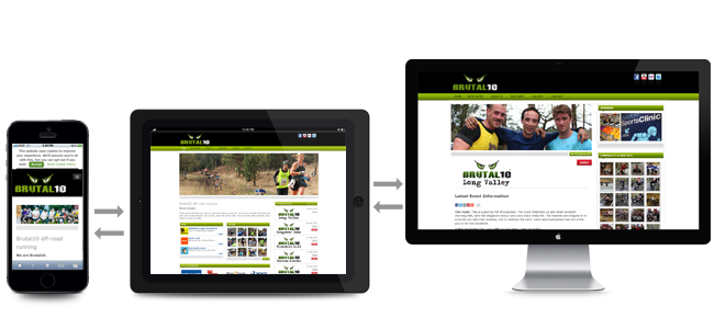
A responsive web design is basically a process of coding and laying out a website in a way that it provides an optimal viewing experience to the users across different browsing machines including laptops, desktops, mobiles, tablets and iPads. It reduces navigation, eases up the reading process and it has the capacity to adapt to the screen size of the user.
A responsive web designer makes sure that the end product will be able to readjust its audio video, visual effects, text alignment, screen layout and UI elements on a variety of devices without any discrimination.
Pro’s of Responsive web design:
Super Flexible:
Responsive web design sites are made with a concept in mind:fluid. Yes responsive web design sites are fluid as content moves freely across screens of all devices. You don’t have to pan, zoom in or out while working with a responsive web design site as the content itself becomes fluid and takes its place over screen. The concept of fluid is linked with water. Just as water drops on a surface move freely to make their place across the surface, the same is the case with content on the site. The content quickly and freely moves according to the screen size of the device and present a perfect user experience.
Improved sales & conversion rate:
One best thing about responsive web designs is that they provide consistent user experience across different devices which makes it easy for the users to get familiar with the navigation of site. This increased familiarity with the interface of a site or store often results in an improved conversion rate which in turn brings more sales. Responsive web design also improves performance of your site by getting in shape according to the screen size of the browser which makes it easy for the users to navigate through your site and make purchases.

Low cost solution:
The advantage of having one single responsive web design site is incredible. We all know that maintaining one site costs less than maintaining two different sites and that is why we prefer going for responsive web design. A responsive web design site meets demands of users coming from different devices with varied screen sizes and that is why it becomes quite easy for the owner to maintain one site instead of two. Having two separate sites for desktop and mobile users will simply cost you twice in terms of maintenance, SEO and everything else. One single responsive web design site also enhances SEO efforts by directing all your users to one single website without discrimination of the device they are using.

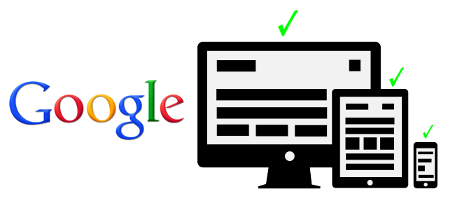
SEO friendly & recommended by Google:
With more than 67% shares of online marketing world, Google is considered the king of everything that goes online. And when Google speaks, search marketers listen to it with great attention. According to Google, responsive web design is the best practice of the contemporary mobile era.
Google says so because a responsive site has only one URL and one HTML which makes it easy for Google to crawl, organize, index and manage content. Google also prefers one responsive site design because it becomes easy for the users to find content on one site, share it, interact with it and link to it from one site. Imagine the same practice with multiple sites and imagine the trouble of interacting and sharing with it too. Having two separate sites of your company will simply reduce USER experience and Google seriously hates it. User Experience plays vital role in ranking sites and that is why responsive design sites are more likely to rank higher in search engines.
Simple & easy to operate-manage & control:
Working with two separate mobile and desktop sites will require you to run two different SEO campaigns. While on the other hand, having on responsive site will require you to run only on SEO campaign with faster results. The advantage of responsive site is that it allows you to run multiple mobile specific SEO strategies on your site by setting particular keywords that are searched while users are on mobile devices. Although a separate mobile site helps you in performing more mobile specific tasks but still you cannot deny the leisure of maintaining a responsive design site. A responsive site cuts down the maintaining costs, SEO campaign costs, saves time and brings more reliable results as compared to having two separate sites.

Let us know what you think?
Responsive web design is an emerging field and we know that our users also know well about it. share your experience with us in comments, let us know other benefits of having a responsive web design.
Credit:-
https://codeboxr.com/blogs/top-5-advantages-of-responsive-web-page-design